Saturday, November 10, 2012

Poor Nate Berkus


I'm sure Nate Berkus is having a rough time of it these days: cancelled show, no Oprah appearances;) So, in an effort to boost his spirits, I made my way 4 blocks to my nearest Target store and bought a couple (well, maybe a little more than a couple) of his items.
I have always been drawn to Nate's design style: clean, simple, but elegant and timeless-many of the same goals that I have when decorating. It was no surprise that his Target line introduces his same aesthetic in the form of accessories, lamps, bath, and bedding.

Here are a few of the things that I particularly enjoyed (and also might add, were basically all that were left on the shelves to choose from):
 
 
I have loved this Chevron patterned urn ever since I caught glimpse of it in an ad. It actually comes in 2 sizes: this larger one and cute smaller version, but I just found out that the larger size is no longer available for purchase. Glad I grabbed it when I did! I'm a sucker for anything gold and deco and these gold vases are the perfect accent piece for shelves. Again, they come in two sizes, and of course, I had to buy both :) The bone photo frame is gorgeous in the graphic pattern and again, complements the other items nicely. Basically, all of his pieces are made to coexist with each other on the same shelf or from room to room.  The black faux leather box above is also awesome. I got it to store remotes on the coffee table.
 

I also purchased some of his towels and washcloths. I was mostly loving the pattern and color, but neglected to see that the quality isn't what I would normally purchase. Oh well, the tags were off and I couldn't return them, so they are here to say. After a couple of washings thus far, they are actually holding up very well. My favorite is the ikat pattern:
I added this caramel color to coordinate:

This rug looks great as well with the towels.
 
Yikes! I bought more than I realized!


Now then, I do have to say that I returned some lamps. Again, I loved the look: stingray and chrome.  Unfortunately, I got them home and realized that the quality wasn't that great. They are super lightweight and topple easily. The lamps are also smaller scale than will work on most end tables. They felt a little light and "cardboardy" to me. 
 
So, all of that being said, I know that you are paying for his name on the products, but also, his level of taste. It's wonderful that beautiful pieces can be accessible to the mass public and at affordable prices. So far, nothing can be ordered online, but check with your store first, because most of the pieces sell out quickly. Overall, I say, "Bravo, Nate!" Now take all of your money made from Target and have a nice vacation.
 
'Till Next Time...

Thursday, October 18, 2012

Ca-razy for Chevron!

Unless you've had your eyes closed for the past few years, you have undoubtedly noticed a pattern that is back with a vengeance: Chevron. Maybe you didn't know it's "official" name, but I know you've seen it. It's classic and simplistic inverted arrow has resurfaced on clothing, walls, floors, and furniture. I feel it works with today's styles so well because it's fresh and modern, while giving instant pattern to a room. By simply throwing down a rug or hanging some drapes, you can have a mod room that's very current. I will say that it's almost too prevalent at this point. Don't get me wrong, I love it too, but it seems to be the go-to design for designers and I almost wish that we could all find a suitable replacement or addition to the graphic family. Nevertheless, here are some designs where the Chevron pattern takes center stage and as usual, steals the show:

Jonathan Adler Dining Room

Same pattern made with salvaged wood


Patriotic Chevron dress


Even tile!

 
If you too are now a Chevron addict, West Elm has a great rug (named by them as the "zig zag"rug)
that is also affordable, and should fix you right up!
 
 
Happy Designing!
 

Monday, October 1, 2012

The Big Book of Chic


We all love a little eye candy in some shape or form, and I must admit I am addicted to design and design inspiration books. I have dozens of books at this point and the number grows daily. Here is another that will be added to the shelves: The Big Book of Chic by Miles Redd. The Big Book of Chic isn't released until November, but it's already getting high marks. I was reeled in by the title, but then once I previewed the pages, I was already online and placing the order. It's glam and high style to the nth degree. Granted, it might not always be practical to have zebra wallpaper or blue lacquer walls, but it's so much fun to see that someone had the gumption to do it! Here is an excpert from the book's introduction:


“This is a book about dreams coming true; the curiosities in the rooms I have decorated; and the people, artists, and places that have inspired me. When all is said and done and I am long forgotten, maybe someone will find this book in a dusty library—if such a thing still exists—and glimpse a bit of the pleasure my life has given me. I want them to have the sensation of dancing across an MGM soundstage, silhouetted in a klieg light, because that was my intention with this book, a very personal blend of work and fantasy.”


—Miles Redd

And here, my dears, are some page examples to wet your whistle:


Again, it's available sometime in November 2012, so if your coffee table needs a little pizazz, I think Mr. Redd has just the thing to help out.
'Till Next Time...


Monday, July 30, 2012

Updated Bathroom

Hi guys! Here are some pics of a bathroom that I designed. The old outdated space needed some major work. I used carrera marble on the floor, shower, and as a wainscoting effect half way up the wall. The floors have 12 x 12 tiles, the walls have 2 x 4 "subway" tile, and the shower floor has 4 x 4 tiles (shower floors slope so always remember to use smaller tiles here that  can be adapted to the drain slope). I even added a solid piece of carrera for the countertop. While visiting Thailand, I had seen an amazing bathroom with a similar look and decided to adapt it for a client. Below are some pics before the bathroom was totally done, but you will get the idea.


BEFORE:


AFTER: (but not totally finished)


I don't have pics with the completely finished bathroom, but it was finished with accents of red, silver towels/rugs and a frameless mirror-turned horizontally:

Hope this helps you with some of your own bathroom design dilemmas!
'Till Next Time...

Friday, June 22, 2012

HOTEL INSPIRATION: Viceroy Palm Springs

Kelly Wearstler has long been known for her bold punches of color and glamour-layered upon a muted background. The Viceroy Hotel in Palm Springs, CA is also one of her signature designs. Here are a few photos of the resort. What inspiration can you take away? Hmmmm.. maybe we should just get a book, a bottle of wine, and take a trip there and find out for ourselves....


Tuesday, March 6, 2012

Downsizing in Style

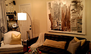
I did panic a bit when I realized that my little family would not only be moving across the country, but also moving from 2000 s/f into 800 s/f! I soon knew that I would be forced to leave behind lots of my favorite pieces of furniture and accessories, but this meant that I would also be able to buy all "new" things.  I only brought 2 chairs, a few accessories, and a little side table....the rest, I found within a 2 week period. I mean, really, what designer worth his salt can't furnish a teeny little apartment in 2 weeks right?! Well, it was a challenge, but I got it done- and all on a small budget. Here are some photos that I quickly snapped of the finished project. The photo quality isn't the best, but you'll get the idea.

As you can see, my living room is a multi-functional space. I wanted each space to serve its purpose, but I also wanted each space to be designated while not blocking any views. I hung a mirror over the small "fireplace" to be the dividing line between the living and dining areas. I also placed a plant near the entrance to the room to give a little buffer from simply walking directly into the space. There was no architecture in the room, so I added some simple ladder style bookcases on each side of the large window. I also hung the drapery rods completely to the ceiling to give the room some height. 
Of course, area rugs are perfect to ground a space, and here, I chose a cowhide ($199 from Ikea).
As I said, I brought two chairs with me; they are polar opposites-but somehow work well together.
I didn't paint the walls (and it's not my favorite color) but at least it's a neutral.
The black leather sofa is also from Ikea and the artwork is from my friend and artist, Neal Wagner.
(Side note: the door you see here is not the main entrance, but leads to a patio).

I chose a trunk as an end table. I loved the touch of silver, not to mention the incredible amount of crucial storage that it provides.


I designated the dining area by hanging a chandelier (that I made from a discarded one) and wired it with a plug so that I could just take it with me when my lease is up. (I'll simply patch the little hole in the ceiling where the hook is located). 


On the dining room walls, I chose a different color, but complimentary shade of drapes. I also repurposed artwork from another project and used it as my dining room art.


This is a shot into the kitchen area. No room for a bar, but a simple tray stand from West Elm does the trick and looks sleek and stylish at the same time.

Yes, there is a bedroom. I'll post some photos of that tiny little room soon and show you some more secrets of how I added some glamor to that tiny space very soon.

I guess the moral of this story is to love where you live, no matter the size. No one wants to come home to a boring, cold home, so get out there and find the things that make you happy, and make your house (or tiny LA apartment) a home. :)


...Till next time.

Sunday, September 11, 2011

A Room with a Mood


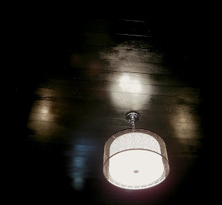
I love to decorate small rooms and make them even more intimate and cozy. This room fits that bill perfectly. I updated the walls with a gloss metallic paint which is almost copper in its tone, but the most dramatic change to this room is the ceiling.


I lined the ceiling with 1 x 4 strips of wood and painted them a high gloss black. The black may seem opposite of what you would do in a small room, but the glossiness of the paint gives the ceiling another dimension while also reflecting the light from the window. The dark ceiling also allows the pendant light to be a stand out feature.


 The dramatic mirror is placed to reflect the light from the window to further brighten the room.


Though the room is somewhat formal, I lightened the formality with the addition of the seashell prints and pillow. The limited and dark color pallete is punched up with the gold and white colors of the pillows, drapes, and prints. A black mid century modern chair completes the room while giving guests a place to sit.