Tuesday, March 23, 2010

Frame Those Walls!


Do you have a room in your house that needs a little pizzazz? I think we all might find ourselves staring at a wall and completely lost as to what we can do to dress it up a bit. Here’s one solution for you: Picture Frame Moulding. The concept is very simple, but the results can be dramatic. I am actually in the midst of designing a space for a client that will include picture frame moulding serving as wainscoting to add some architectural features to a dining area, but the application can and does work in any room.

Definition of Wainscoting: 1. A facing or paneling, usually of wood, applied to the walls of a room.
2. The lower part of an interior wall when finished in a material different from that of the upper part

Wainscoting is the general term for adding a layer of facing to your wall. As mentioned above, most wainscoting appears on the lower 3rd of the wall, but some, as in Arts & Crafts homes, will extend to ¾ of the walls.

Picture frame moulding can serve as wainscoting by providing the same look, but can be done inexpensively and relatively fast.

The basic components of creating wainscoting with your picture frame moulding is to first, decide on how much of the wall that you would like covered. Let’s assume the typical bottom portion. You then will add a chair rail moulding at the top portion of your marking (this moulding and all mouldings will be nailed or glued right into your wall) which is somewhere around 32 inches. Next, simply measure the spacing for your picture frames and attach them to the wall as well. There are different ways to add the frames, ie all the same size, varied sizes, varied spacing, etc. I prefer uniform spacing between each and the same size frames as well.
Some choose to paint the entire area below the chair rail, the same color. Others may only paint the moulding and leave the wall the same, especially when the picture frame extends all the way up the wall.  Still others, might apply wallpaper inside each frame. Your decision totally depends on the look that you are going for. If a classic, traditional look is your style, I would paint the entire area the same color, typically a bright white. When painting the area the same color, it gives the illusion of a custom built wainscoting; I also prefer painting it with a high gloss paint to further advance the illusion.
If a more modern approach is for you, perhaps paint the bottom portion a darker color than above the chair rail, and the moulding even another color.

This is a fairly easy project for any home improver, so don't be scared!

I’ll be doing a detailed how-to on my project very soon and will post pictures for you step by step.
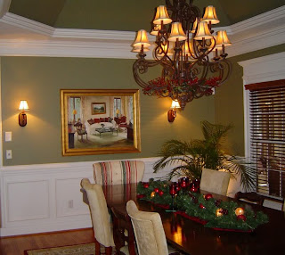
In the meantime, here are some inspirational photos of picture frame moulding:




Tuesday, March 16, 2010

EXterior Design


Don't forget your exterior when decorating your home. "Really?" you say, "How do I apply design principles to the outside of my home?" Answer: just use the same design concepts that you use on the inside of your home!
Here are some tips:

* Curtains: Hang curtains to your porch, patio, pergola, or deck. Of course, you'll have to make sure that the drapes are made of outdoor friendly fabric, but curtains add a touch of sophistication and warmth when brought outdoors (not to mention they can easily hide any ugly features that you don't want seen).


* Furniture: Furniture placement is key in an outdoor area just as it is in your living room. Center a conversation area around a firepit or coffee table. Make sure you have comfortable padding or throw pillows so that your company will want to linger there. If you're planning an event with a large group of people, make sure that you have enough seating for everyone and group chairs around small tables rather than lining them up in a row.(Temporarily bring some accent tables from the interior of your home if necessary) This will allow manageable converstions between your guests.


*Lighting: (my favorite!) If you have an evening gathering on your patio or porch, don't forget the lighting. You can instantly change the mood of your party with beautiful lighting. Simple lanterns with candles hung on tree limbs or hooks on your porch/patio give a lovely glow. If you're uncomortable with actual candles, you can find many battery operated options-complete with flickering effect.
Landscape lighting is normally a part of landscaping, but add to it with some simple tiki torches (ncie to look at and also can keep the bugs away). However, some tiki torches can be tacky, so look for stylish iron torches for a more upscale look. They even come in sconce style torches!


A cheap and easy lighting solution is to simply add sand or soil to a brown paper bag (you can also cut patterns into the bag) and insert a tealight candle in the center of the sand. I like to space these luminaries approximately 2-3 feet apart for more effect.
Hurricane lamps or lantens with candles in small groupings of 3 or more are elegant. Don't space the lamps apart or individually, the grouping will create more impact.

Another simple solution: just add candles to your glass food (Mason Jars) canning jars and selectively place or hang with wire.


No matter which lighting idea that you choose, make sure that you have safely prepared any lighting that involves actual flames or heat.

Outdoor Rugs: Outdoor spaces are easily changed with the addition of an outdoor area rug. Again, make sure that the material is suitable for outdoor spaces and add one ore more just the way you would in your home: under a dining table, coffee table, etc. Choose a colorful pattern to break up monochromatic spaces.


Thursday, March 11, 2010

Money Saving Window Idea


Of course, we all want to save money, but not at the expense of aesthetics.
Following that concept, I have always tried to come up with new and affordable ways to achieve similar looks of expensive items. I have done everything from repurposing a dresser into a bathroom cabinet to creating a "chandelier" out of gutter guards (details on that to come..)
I recently completed a makeover for my very messy and cluttered garage (Video to come soon) and I had a window in the garage that I hated. It was the only window in my home that I didn't replace-partially to save money, but also because it was on the backside of the house and wasn't seen a lot. Now, once the garage renovation started, I couldn't bare to leave that old ugly window the way it was, so I changed it for cheap. I didn't want to rip it out and install a new one, but I also wanted it to look good, allow light to flow through, and have privacy.
At that point, I did what I normally do in that situation: visit Lowes and/or Home Depot for ideas. I came across the lighting department and noticed the 2 x 4 sheets of acrylic that is used for drop in lighting in suspended ceilings. Bingo!
They almost have the look of glass and come in several styles and patterns. I chose the "crackled glass" look (very similar to the "frosted windows" in bathrooms) and it worked perfectly!

Here are the steps I took:

Measure the window for the size you need. I had to measure the top and bottom part of the window for 2 separate sections.
Clean the window thoroughly with window cleaner.


Lay the acrylic on a table or hard surface and measure and mark the size needed.
Place painters tape, or masking tape, over the area to be cut to avoid splintering.
Cut the drawn line slowly with a sharp pair of scissors (I used tin snips)


Apply the sections with clear silicone caulk and let dry.
That's it! A "new" window for around $20 total!

Sunday, March 7, 2010

The Case for Mismatched Dining Room Chairs


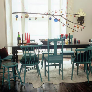
Say what you will, but the "matchy-matchy" look of furniture does not always apply to every decor. Think about your dining room. Most of us did what was easiest: simply go to the furniture store, find a dining room set with matching chairs, sideboard, cabinet, etc. and there is nothing wrong with this approach. However, I think that some of the most interesting dining rooms, like all rooms in a home, are a collection of things (or at least they appear to be so). Take your dining room chairs, for instance. How much more character could be infused in the room with mis- matched chairs? Now you can really make a mess out of this idea if not carefully planned, but if you take your time, you can really achieve an eclectic mix of chairs that blend well. Below, I have found some design inspirations of other mis-matched dining room chairs; in them, you will see how to best get this look in your own home. Some things to consider: keep the size of the chairs in proportion (ie don't place three large chairs on one side and three small on the other-perhaps, vary every other chair), think about an element in each chair that blends them all (maybe a similar shape or a design in the back of the chair, or even simply changing the seat cushions in different chairs to the same coordinating fabric), don't buy chairs too small to reach the table comfortably (sounds simple, but is very easy to forget without measuring). This list could go on and on, but you get the idea. So take some time and see what you come up with, then sell half of your current matchy matchy chairs on craigslist! :)


Friday, March 5, 2010

MBA Speaking Engagement


This past Wednesday, I was asked to be the featured speaker at the MBA of Orlando.
MBA (Metropolitan Business Association) is a great group of people with a common goal; if you've never heard of them, here is their website description:

Over 200 members strong, the Metropolitan Business Association is Central Florida’s GLBT chamber of commerce. With many opportunities to get involved with the local gay, lesbian, bisexual and transgendered community, we’re proud to be an integral part of the Orlando area community.

The MBA seeks to:

Nurture
Establish and nurture a network of businesses and professional resources for gay men, lesbians, bisexual men and women, transgendered persons and allied communities.

Encourage
Encourage fellowship and support among businesses, professionals, individuals, and charitable pursuits in the GLBT and allied communities.

Oppose prejudice
Oppose prejudice in society at large and within the GLBT and allied communities on the basis of sexual orientation and gender identity.

Foster
Foster communications, tolerance, and mutual support among GLBT persons and the allied communities.

Be role models
Provide positive role models in the GLBT and allied communities.


I was able to speak from the heart about my experience on HGTV thus far and of how life opens doors for you that you never knew were even there. From my early dabbles in interior design for my family-to my own homes-and now working to create beautiful spaces for others, I am certainly blessed to do what I love. I would encourage everyone to follow that little voice within and keep the passion alive in your personal life and your career. Trust me, your time on earth will be much better for it. Here is a favorite quote that I shared in my message:
"It takes courage to grow up and turn out to be who you really are."
– E. E. Cummings


Until Next Time...

Tuesday, March 2, 2010

Before and After 2: THE KITCHEN

I thought I should show the kitchen renovation since you saw a peek of it in yesterday's post. The bones of the kitchen were thankfully good, so I just had to strip it down and start from scratch.
Here is the kitchen as it was when we bought the house:


As you can see, it was probably the same way it looked when the house was built. At first glance you might not think the cabinets were that bad, but upon closer inspection, you'll notice that they were this hideous fake white-washe wood look. They also had strange rounded edges. I found a date on the back of one of them that said 1969. In the first pic, you can see that the kitchen had an odd doorway with the saloon doors, leading to the old tiny dining room. To get more cabinet space and to get rid of that opening, I slid the fridge down and closed in that door with my configuration.

Here is the kitchen after everything has been removed and the door opening closed up, a clean slate!


Now the real fun began as I started to reconstruct the kitchen to my standards. I searched everywhere for cabinets and never found the style that I liked for the room, so I decided to look to Ikea. Now, at the time, we didn't have an Ikea in Orlando, so I hooked up my handy covered cargo trailer and headed to Atlanta! Yes, I drove all the way to Atlanta to get those cabinets. Talk about pressure! I had to make sure that nothing was left out for this kitchen as I didn't want to drive all the way back for 7 hours again. There was only a small issue with missing pieces, but they were ordered online. Ikea cabinets are cost effective, look great, and have a good warranty on them....HOWEVER, just like all of their flat packed stuff, they are not the most fun to assemble, especially when it's an entire kitchen. Of course, I did it, but it took me about 4 days to do so. Ikea cabinets also are handy because of the track that the cabinets attach to at the top. It is made so that you can slide the upper cabinets to the exact position that you want without breaking your back. Then, you simply tighten them up. Nice.
So here it is: the finished kitchen remodel:


Everything is new: Lighting, marble floors, stainless backsplash (well looks like stainless, but is actually panels that you cut yourself and glue on-super easy to install), and of course, cabinets. I kept our old appliances to save money, but will soon upgrade to stainless to really tie it all together. Of course, I forgot to move the construction trash can :)

The pic below is from a little alcove that I made to place the small kitchen table. I wanted to set this area apart so I chose a grasscloth paper on the wall. Secretly, I planned this entire space size around that little table (also from Ikea).

And four weeks later, I had a finished kitchen! (Don't want to do that again any time soon)

Monday, March 1, 2010

Remodel Before and Afters

Some of you might know that I bought a major fixer-upper with my last home purchase. This house was a wreck and had basically been untouched since it was built in the late 60's. I normally am drawn to much older homes with traditional features, but here in Orlando, those are not as readily accessible (esp in our price range). So the decision was made to buy this one, crazy as it seemed at the time! The first night in the house, I took a hammer and banged a hole in a wall (non-load bearing, of course) and with that one whack, started the process of remodeling this beast. (The hole in the wall was to become the opening between the dining room and the living room, and I had known from the first time I had seen the house that I would be adding this.)
In an earlier post, I mentioned that I am currently redecorating my dining room (almost done!) and so I thought I would show some before-before pictures of how it got to the point before my recent decorating.


This pic below is how the house looked when we bought it. This room, whatever they used it for, was just one big open space with no direction or purpose. The kitchen (we'll get to that remodel later) was totally visible and from the way it looked then, should not have been visible to anyone. Apparently, there used to be some sort of circular bar that separated the two areas and was evident from the nail holes in the terrazzo. BTW: the door to the right was one of the entrances to what the former owner called the dining room, we now enclosed and use as the office.


This picture, below, is after I began painting and constructing the separating walls between the kitchen and the new dining room. I had found the glass from some old shower doors in my garage and decided that I just couldn't bear to throw them away, so I devised this plan to utilize them in the dividing walls. This was the perfect solution, in my opinion, because the house was from the 60's and these glass panels had a style that looked as if they could fit in easily there, while at the same time, being elegant.
Shower doors elegant? I think so.

I built the walls, leaving the opening for the glass panels....


Added oak wood veneers to the drywall...


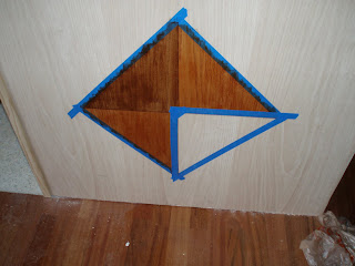
I then started my faux inlaid wood project consisting of stain (the kind with the polyurethane already in it) and painter's tape in a diamond pattern.


And below is the finished walls with glass shower panels installed and the "inlaid" wood at the bottom. I also applied a coat of clear poly on the entire oak wall and framed out the "windows" and capped the walls with oak strips. I definitely achieved my goal: a simple, yet elegant, dividing wall between the kitchen and the new dining area. Now I can leave the kitchen slightly messy without having to stare at it with my guests during dinner. Mission acccomplished!