Kelly Wearstler has long been known for her bold punches of color and glamour-layered upon a muted background. The Viceroy Hotel in Palm Springs, CA is also one of her signature designs. Here are a few photos of the resort. What inspiration can you take away? Hmmmm.. maybe we should just get a book, a bottle of wine, and take a trip there and find out for ourselves....
Beautiful Affordable Design is an extension of johnmcclaindesign.com. Here, I hope to share inspirational ideas for redesigning your space. I have a true passion for interior design and decorating and love to share that passion with others. My hope is that you, too, will find that design inspiration can come from any source.
Friday, June 22, 2012
Tuesday, March 6, 2012
Downsizing in Style
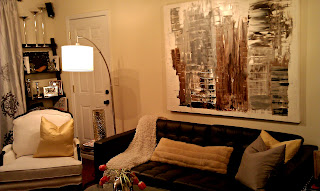
I did panic a bit when I realized that my little family would not only be moving across the country, but also moving from 2000 s/f into 800 s/f! I soon knew that I would be forced to leave behind lots of my favorite pieces of furniture and accessories, but this meant that I would also be able to buy all "new" things. I only brought 2 chairs, a few accessories, and a little side table....the rest, I found within a 2 week period. I mean, really, what designer worth his salt can't furnish a teeny little apartment in 2 weeks right?! Well, it was a challenge, but I got it done- and all on a small budget. Here are some photos that I quickly snapped of the finished project. The photo quality isn't the best, but you'll get the idea.
As you can see, my living room is a multi-functional space. I wanted each space to serve its purpose, but I also wanted each space to be designated while not blocking any views. I hung a mirror over the small "fireplace" to be the dividing line between the living and dining areas. I also placed a plant near the entrance to the room to give a little buffer from simply walking directly into the space. There was no architecture in the room, so I added some simple ladder style bookcases on each side of the large window. I also hung the drapery rods completely to the ceiling to give the room some height.
Of course, area rugs are perfect to ground a space, and here, I chose a cowhide ($199 from Ikea).
Of course, area rugs are perfect to ground a space, and here, I chose a cowhide ($199 from Ikea).
As I said, I brought two chairs with me; they are polar opposites-but somehow work well together.
I didn't paint the walls (and it's not my favorite color) but at least it's a neutral.
I didn't paint the walls (and it's not my favorite color) but at least it's a neutral.
The black leather sofa is also from Ikea and the artwork is from my friend and artist, Neal Wagner.
(Side note: the door you see here is not the main entrance, but leads to a patio).
I chose a trunk as an end table. I loved the touch of silver, not to mention the incredible amount of crucial storage that it provides.
I designated the dining area by hanging a chandelier (that I made from a discarded one) and wired it with a plug so that I could just take it with me when my lease is up. (I'll simply patch the little hole in the ceiling where the hook is located).
On the dining room walls, I chose a different color, but complimentary shade of drapes. I also repurposed artwork from another project and used it as my dining room art.
This is a shot into the kitchen area. No room for a bar, but a simple tray stand from West Elm does the trick and looks sleek and stylish at the same time.
Yes, there is a bedroom. I'll post some photos of that tiny little room soon and show you some more secrets of how I added some glamor to that tiny space very soon.
I guess the moral of this story is to love where you live, no matter the size. No one wants to come home to a boring, cold home, so get out there and find the things that make you happy, and make your house (or tiny LA apartment) a home. :)
...Till next time.
Sunday, September 11, 2011
A Room with a Mood
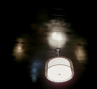
I lined the ceiling with 1 x 4 strips of wood and painted them a high gloss black. The black may seem opposite of what you would do in a small room, but the glossiness of the paint gives the ceiling another dimension while also reflecting the light from the window. The dark ceiling also allows the pendant light to be a stand out feature.
The dramatic mirror is placed to reflect the light from the window to further brighten the room.
Though the room is somewhat formal, I lightened the formality with the addition of the seashell prints and pillow. The limited and dark color pallete is punched up with the gold and white colors of the pillows, drapes, and prints. A black mid century modern chair completes the room while giving guests a place to sit.
Sunday, July 10, 2011
Painted Floor Inspirations
I have always loved the simplicity of painted floors. I'm not saying that all of the designs on painted floors are simple-far from it- (as seen by some of the designs in this post), but the basic idea of painted floors is a very simple one. Essentially, you can paint over any floors with the right paint product. I have seen elaborate designs on hardwood, parquet and even plywood floors, but you're really only limited by your imagination and willingness to paint over what you curently have. I was reminded of the beauty and drama of painted floors while watching Mary McDonald's floor transformation on
Painting your floor is not only a great way to update your room, but it's also a wonderful way to hide flaws on not-so-perfect or older flooring.
Ok, enough babbling, here are some great floors that have been accentuated with nothing more than a little creativity...oh yeah, and some paint. :)
Till next time....
Monday, June 6, 2011
Befores and Afters
I realize that it's just as important to remember where we came from as much as where we are. The same applies to a room makeover, so I've dug up some befores of rooms that I have previously posted.
Let's start with this lovely eternally 80's powder blue bathroom. I gutted this bath down to the studs so there was no trace of any blue tile or cheap vinyl floor. I also opened up the small space by removing the shower wall and installing a jetted tub with shower. You'll also notice classic white subway tile, but the new floor is marble-as well as the vanity counter top. I wanted a vanity that looked more like furniture and was pleased with this piece. The final touch was the toile wallpaper, which I consider very neutral, actually. Toile can work well if you break it up with large pieces of solid colors such as the vanity, shower, and even the toilet.
Next, is a dining room with another drastic change:
Let's start with this lovely eternally 80's powder blue bathroom. I gutted this bath down to the studs so there was no trace of any blue tile or cheap vinyl floor. I also opened up the small space by removing the shower wall and installing a jetted tub with shower. You'll also notice classic white subway tile, but the new floor is marble-as well as the vanity counter top. I wanted a vanity that looked more like furniture and was pleased with this piece. The final touch was the toile wallpaper, which I consider very neutral, actually. Toile can work well if you break it up with large pieces of solid colors such as the vanity, shower, and even the toilet.
BEFORE:
AFTER:
BEFORE:
AFTER:
BEFORE:
AFTER:
Next, is a dining room with another drastic change:
BEFORE:
AFTER:
So there you have it, a couple of before and afters. I will be posting more soon, so keep checking back & Happy Designing!
'Till next time...
Saturday, April 16, 2011
The Delano Hotel Miami Beach
Here are a few shots of the lovely pool and grounds area of the Delano Miami Beach. There is an "Alice in Wonderland" feel to it all.
Thursday, March 31, 2011
I've Got Butterflies!
I admit it. I subscribe to more design magazines that I can ever read in full, but I am able to flip through and find things that catch my design eye. While parousing a recent edition of House Beautiful I noticed delicate and beautiful, sculpture-like butterflies on a wall of a featured home. I assumed it was some sort of exotic material that I could never dream of having, but after further reading, I realized the butterflies were made of beer cans!
Yep, beer cans. Designed by artist Paul Villinski, the butterflies are cut out of found aluminum cans and then attached to the wall in various patterns. As you see, the butterflies seem to flutter on the wall and actually, they do move a little when a puff of air blows by. Genius!
These butterflies instantly turn a blank wall into a work of art by adding texture, sculpture, and movement.
Villinski also transforms old records into similar works of art.
So now, my mission is to try and replicate these georgous dainty butterflies (not to diminish the creation of Mr. Villinski). I'll be sure and keep you posted if I get any where close to his collection.
In the meantime, enjoy and and be inspired with your own homes!
'Till Next Time...
Subscribe to:
Posts (Atom)


