In an earlier post, I mentioned that I am currently redecorating my dining room (almost done!) and so I thought I would show some before-before pictures of how it got to the point before my recent decorating.
This pic below is how the house looked when we bought it. This room, whatever they used it for, was just one big open space with no direction or purpose. The kitchen (we'll get to that remodel later) was totally visible and from the way it looked then, should not have been visible to anyone. Apparently, there used to be some sort of circular bar that separated the two areas and was evident from the nail holes in the terrazzo. BTW: the door to the right was one of the entrances to what the former owner called the dining room, we now enclosed and use as the office.

This picture, below, is after I began painting and constructing the separating walls between the kitchen and the new dining room. I had found the glass from some old shower doors in my garage and decided that I just couldn't bear to throw them away, so I devised this plan to utilize them in the dividing walls. This was the perfect solution, in my opinion, because the house was from the 60's and these glass panels had a style that looked as if they could fit in easily there, while at the same time, being elegant.
Shower doors elegant? I think so.
I built the walls, leaving the opening for the glass panels....
Added oak wood veneers to the drywall...
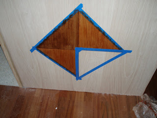
I then started my faux inlaid wood project consisting of stain (the kind with the polyurethane already in it) and painter's tape in a diamond pattern.
And below is the finished walls with glass shower panels installed and the "inlaid" wood at the bottom. I also applied a coat of clear poly on the entire oak wall and framed out the "windows" and capped the walls with oak strips. I definitely achieved my goal: a simple, yet elegant, dividing wall between the kitchen and the new dining area. Now I can leave the kitchen slightly messy without having to stare at it with my guests during dinner. Mission acccomplished!

No comments:
Post a Comment